Tuesday, 28 February 2017

406: Sticker roughs

Kind to others

I asked friends and family to think of something kind to say to someone, anyone, a neighbour, an alien but the responses were either ridiculous or negative so I thought about how people can neglect themselves and not be kind to themselves which is important as it determines how kind you are to others.  

Be kind to yourself

After deciding on being kind to yourself as the theme, there are lots of subtle acts of being kind to yourself but I wanted to focus on a universally recognisable act of having a moment to yourself to think or hold yourself. Touching yourself (not in that way), a hand on the shoulder is a small but effective symbol of reassuring yourself.


I don't know if it's the colours but this rough works for me. It will work with two colours - I feel the two colours should be similar to help give it harmony and make sure it's not too jarring or contrasting. The act of putting her hand on her shoulder and looking down communicates well that she's thinking, reassuring herself for a moment. My only problem is making sure the fingers are recognisable as fingers and don't blend too much with the background colour.

I'm pleased I've been decisive and quick with my decision making. It's good to go with a good idea and trying to develop it to make it great rather than worrying about having a great image straight away, which never happens without working on it.  


Monday, 27 February 2017

406: Use of shape

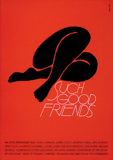
Simple shapes - Saul Bass

I've been looking at artists who used simple forms in their art to great effect. Saul Bass' posters use minimal symbols that have maximum effect in communicating an element of a film or an iconic moment. The Magnificent Seven is incredibly simple but the colour red gives it an dangerous edge and the method of using tally marks suggests only one person may survive at the end of a brutal game. So simple yet powerfully symbolic.  


Picasso/Matisse

I want to look at being kind to yourself as an act of kindness and while researching old masters artists, Picasso and Matisse's paintings and drawings are the kind of direction I'm naturally going with my sketches. Their forms could be recreated in Illustrator and using two colours only. They have limbs and faces intertwined which would work well for a circular format.
Universal appeal - simple, recognisable shapes
Harmonious, symmetrical, elegant, rounded?


Thursday, 23 February 2017

406: Final gifs

I'm happy with the final gifs. Each gif has a different purpose in telling the characters story. The digital gif below shows the character doing it's day to day job of searching the barren landscape for what ever it is it's searching for. The change of colour was what I saw when I listened to the song. I usually associate colours with music so wanted to get lots of colour in there.


I thought this paper cut out was a development of illustrating the solitary nature of the character. The sense of infinity came to mind as the song is very long and repetitive and puts you in a trance so I thought about how the character may have repetitive habits such as watching the sun rise and sun set to pass the time.


I got an idea of making a puppet but then thought a silhouette might be more sombre and intriguing for the audience. I was surprised at how expressive the black paper could be when used in this way. This gif works really well in giving the character a bit more depth and the little interaction with the bird is enough to tell a bigger story of how the character is perhaps developing increased curiosity of it's surroundings, wanting to make a friend.  


Wednesday, 22 February 2017

406 - I See Faces - Character

My character's environment

From the early stages of listening to my Brian Eno song I definitely felt themes of tranquil landscapes and lonely, plodding creatures in a deserted environment.

I used the library to look up deserts and mountain ranges around the world but the desert seemed like the most appropriate place as my character could really standout against the bare background and also it creates the sense of the character working alone.


These oil pumps really work in terms of movement and structure for what I had in mind. It's repetitive movement and lonely location is how I imagined my character.


OUIL 406 - Acts of kindness - research

 Pinterest research

Pinterest is brilliant for getting ideas and inspiration for a new project. I searched for scout badges and acts of kindness. The badges below are 'alternative' scout badges which aren't exactly acts of kindness but are useful for thinking about how diverse and imaginative a badge can be.

I can use text so the image doesn't have to be too literal.


These are simple but beautiful badges and could be recreated using vectors in illustrator and communicate a message with minimal shapes and patterns.


Acts of kindness

There's loads of stories and examples of acts of kindness on the internet which does give you a release of endorphins reading about them. Actual acts of kindness are probably the way to go as it's a personal thing that needs first hand experience to get some ideas going for how to visually explore kindness.

Local places? There's lots of charities around Leeds to look at but I also want an appropriate balance with my commitment to the project and any act of kindness. It's important to not just do an act of kindness as a token gesture or to commit to a charity purely for the projects success so maybe a simple, light act of kindness is a good place to start.
An act of kindness could be spontaneous, grand, financial, random, personal.

Is there someone I see often who is kind to others or does a selfless act??

Here's Dan..


Illustrator GIF

T. S Abe

When we looked at gifs it reminded me of this gif by T. S Abe. It's a self portrait and it has dedicated craft, technical skill and captures her attitude. She turns, looks you up and down, leaving you not quite sure what she thinks of you. It's a small exchange that we have every day with strangers but in this drawn form it becomes an infinite interaction, never knowing what she's thinking. The simplicity of the hair really appeals to me and the gradual depth of detail towards the eyes and mouth are things that I am starting to find very effective in my own drawing. Simplicity blended with refined detail. For me, her look is a look of defiance and a show of strength to anyone trying to confront her. 


This image below shows how labour intensive it will have been to create a seemingly smooth gif. She hasn't overcomplicated it but the movement of her eyes forces the audience to ask questions and be intrigued.  


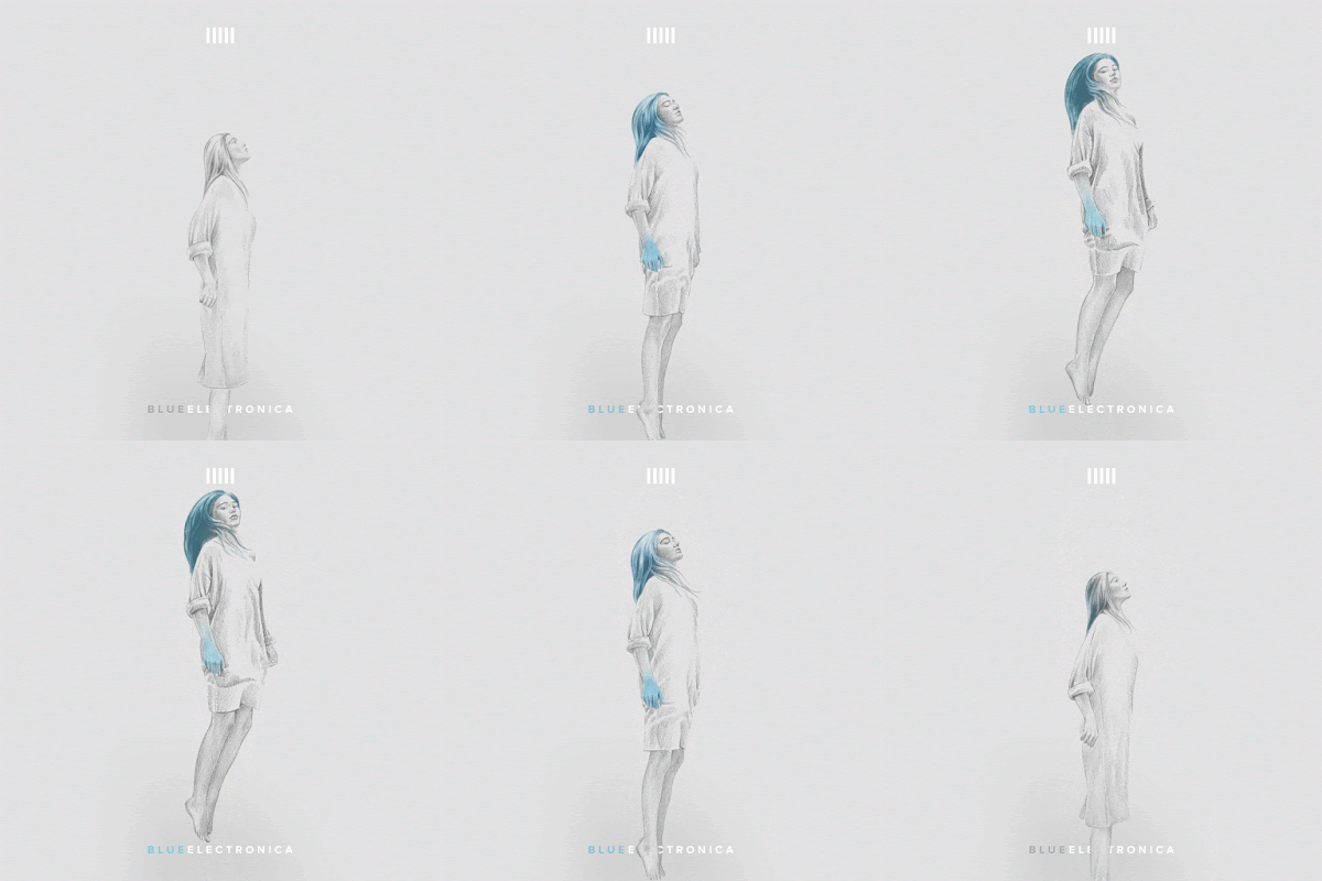
I found more of her gifs - this one is for a mixtape by The Code which is again really beautiful in it's simplicity and use of one colour. It's communicating the effects the music are having on the listener,, the blue spreading into the girl's body and hair. 


Tuesday, 21 February 2017

OUIL404: Fan Art - Leonardo da Vinci screen print

Leonardo da Vinci

Choosing Leonardo da Vinci for my fan art poster was easy. I have favourite films and music but da Vinci is someone who I have always had huge respect for and one of the people who most inspires me. He's obviously considered a genius and admired by everyone for his talent but I also have a personal, life long obsession with his drawings and his desire to know as much as he could to understand about the world.  


After a slightly dodgy start we managed to produce some prints that turned out really well and were what I had hoped.

Alternative interpretation, not a facsimile

I thought it would be a good idea to simply copy a few of his drawings and paintings to get a feel for which areas of his work I wanted to use. Quickly it was clear that copying his drawings is difficult in itself as they are technically some of the best drawings ever so I needed to use a different method.


I also wanted the poster to be a modern interpretation of his work rather than an ineffectual copy.
Why da Vinci? What about him do I admire most?
I thought about what works of da Vinci's most people think of and there were the obvious ones such as Mona Lisa so I tried to create a modern vision of her using reference photos/found images. A more graphic style make it feel more contemporary but I thought hard again about what aspects I personally like but his paintings aren't the main reason I'm a fan of his. I needed to celebrate his drawings without copying them badly somehow. 


The two sketchbook pages above are exploring the famous images often associated with da Vinci. 
Such an iconic image has been reimagined thousands of times. Maybe another version is a cliche in itself.  


I looked at the anatomical drawings which I find both technically and aesthetically incredible. I copied a few of the drawings and gradually tried to isolate and simplify the complexity of his drawing style. 
I find when I draw from references in a fluid, non exact way, that the most important shapes and tones are brought to attention and any other details are lost. I focused on the light and darks and wanted a simple graphic representation. 


Collage and black ink worked together as a striking and vivid version of his anatomical drawings of the muscles in the human body. The Dover book had some perfect images as the old etchings were from a period when realism was required and they reminded me of the renaissance paintings but also Leonardo's anatomical drawings and studies he did for paintings.  


Another thing about da Vinci was that he never finished many of his projects. I seem to have a soft spot for unfinished works of any artist, and illustrators whose work is selective and seemingly abandoned and da Vinci often felt he could never truly represent the beauty of something and only ever make an inferior version. So cutting out a section of the complete etchings gives a them new meaning, and immediately focuses attention on the anatomical structure as well as a non final piece of artwork. 


I was really happy with the positives after applying the ink. It had the modern feel I wanted and a bold, solid aesthetic which i knew would work on screen print. The limbs remind me of renaissance paintings and the black ink adds the anatomical muscles. 

Less is more
The problem I've been having most on the course is probably managing my time for each project. Either rushing near the end or not spending enough time playing with ideas. But because my screen print partner could only do the following Monday my time was halved which helped me focus and produce one of the better pieces of work I've done in probably the shortest time. 


Tuesday, 7 February 2017

Miro - I See Faces

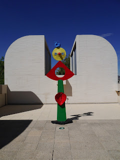
Miro museum, Barcelona 2016

I tried the library for some inspiration for 3D ideas and remembered Miro's work from when I was in Barcelona in September. My character could be a Miro creation and it was really interesting to see his sketches and how rough and loose they are. His 3D creations look almost exactly like his sketches which is a brilliant example of realising a character from sketch to 3D model.


I can see the sketches are drawn straight from his thoughts on to paper. No pretty pictures or shading. I'm pleased to see he also can't be bothered to finish colouring in the shapes as I do that too. I don't know how quick his drawing technique was but the sketches serve their purpose perfectly, to get an idea down and I can see his personality and imagination is maintained from the initial sketches into the 3D sculptures. The sculptures have the energy and playfulness of his sketches. He often used an arrangement of inanimate objects as a starting point for his sculptures, bringing them to life.