Sunday, 13 November 2016

OUIL403: Book Cover Final

Book Cover Final

I'm very happy with the illustrations on the book cover but I should have use digital for the type. This takes away from the overall success but I will learn from this for the future.

Spend more time on researching and testing typography
How will the type work with the image?
The hand drawn type is wrong for the tone of the book and illustration


The combination of colour and pencil drawing is the main positive I will take from the brief.
I want to develop this technique as it has a lot of flexibility and can be manipulated easily.
I've challenged myself to use pencil drawing in an interesting way and the colour allows the pencil lines to be more bold and expressive.

I didn't want the drawing to be a photo real copy but the small detailed section draws the viewer in and adds a bit of interest for the audience, focusing on the eyes.


Overall I feel the cover is a failure as I didn't put as much time into the typography as the image making but I believe the mistake will be a blessing in the long term for improving my skills.


Wednesday, 9 November 2016

OUIL403: Illumination final editorials


Illumination

Three pieces with a similar running tone and texture

I successfully kept a continuous style for all three pieces. I decided the tone needed to muted in terms of colour and used a grainy almost downbeat colour scheme to suit the pessimistic nature of the lecture.

Pessimistic colour tone.
Cautionary/bleak imagery with dark humour.
Important consideration of layout to fit images within the three frames.

The 200 x 200 below is intended to show the potential explosive danger of casually standing and staring at misjustice without acting.
I feel this would certainly work well as an editorial piece as it is thought provoking yet has only two main objects within the frame so can communicate efficiently my personal feelings towards the piece of writing but also the message I believe the author is trying to get across.

I'm glad I changed the white background to a more grainy texture as the bomb and figure seemed less solid. The background adds strength and tone to the overall image.


The landscape piece is a more surreal feel that can add a lot to an illustration, allowing the audience to interpret the image as they want to based on their political outlook.

Comical undertones.
Modern composition - the layout is as if the woman is more concerned with having a photo opportunity than realising the danger that surrounds her.
Muted monochrome - the lack of colour keeps the tone of the piece pessimistic and cautionary despite the comical composition.
The piece communicates well the current modern political environment of lack of engagement with facts and issues by society and political leaders.  


 Simplicity

I wanted to explore a simple, minimal piece for one of the designs.
Matt suggested trying to represent the idea of not listening with a diagram.

The simple sound waves are easily recognisable and the gritty background is noisy.
The silhouette allows the figure to be more universal and symbolic than using a photo.
It could be interpreted as a warning sign similar to road signs in it's simple clarity.


Digital collage

It's important to keep using Photoshop purely as an editing tool eg to move and physically arrange a digital collage as if hand crafting using paper.

It's vital to keep my personality in the work.
The found images are part of the image making process and Photoshop is simply an effective tool for arranging them.

Subtlety is the key when using Photoshop.
If it looks like anyone could have created your image then you've gone wrong in the image making process.

OUIL403: Illumination development

Illumination - first ideas

One of the themes I decided to explore for the lecture was the idea of the silent majority. During the photoshop workshops I learnt about the stamp tool that can be used to create strange rearranging of faces.
I've tried removing the mouths from my found images to illustrate the idea of not having a voice and adding red for the dangers of not speaking up.

I'm not sure if the illustrations are clear and perhaps too ambiguous for such a strong message of wanting to change the world for the better.  

Should the tone be more optimistic? Apocalyptic? Sinister?

I think they should have a more cautionary tone to reflect the text.


I really like the texture and layout as a possible landscape idea. I also think the partial removal of the mouth of the woman gives the impression of some people who try to speak out against issues but lack the ability to do so effectively. The red highlight of the woman in the centre is to represent the potential ability of someone in society who is brave enough to stand up to the waves of ignorance in her generation.

A play on 'Your country needs you' poster. Empowerment, bravery and individualism.

Is red an appropriate colour to highlight the silent majority.
Red in a political context could be divisive.
Red does work however aesthetically with the monochrome found images. 


OUIL403: Book Cover - Sketchbook ideas


Sketchbook Ideas for Book Cover

Things to consider for the book cover:
Tone of the book - the book is written by a respected academic so the tone needs to have a respect for the author's status as a serious academic.  
Audience - The design of the book needs to appeal to an audience with a non-academic background in science as the book can appeal to a wide group of people.


I want the cover to stand out with my personal voice and opinion being in the imagery.

The geometric shapes and head themed collages are visually strong but do they communicate the tone of the author and content? 

The ideas so far have a surreal quality I like but also manage to focus on the human head element.
The use of bright colour on top of black/white images is bold and works well on white background.


For a complex subject are these surreal collages too simplistic or do they help broaden the appeal of the book to a wider audience?
The pencil drawings have a delicate element that works with the theme of human evolution as they have a 'human' touch.
I do really like the collage ideas but feel I need to use my drawing as I can become too reliant on my collage designs and need to expand my crafting techniques.


Tuesday, 8 November 2016

OUIL403 - Judge A Book By It's Cover

Group Crit

The group crit was a big help in my decision making on choosing my final design for the cover.
The two designs below will be the final jacket idea.

The fine drawings combined with oil pastel representing sections of the skull got the most positive feedback.

Crit feedback - 
Think about using different angles of the head.
Maybe have the back of the head for the back cover.
Will the background be white/coloured?
The book title could be incorporated into the hair of the head.
Keep the skull detail to communicate the book's subject. 


Collage drafts

The yellow collage design below got positive feedback too but the striking quality of the yellow shapes and sections of skull on the face can be replicated with the fine drawing/oil pastel design above.


The silent crit gave positive feedback about the collage designs but said they wanted to see me use my drawing in the final design. I feel the drawing will add my personality into the final outcome.


OUIL404: Shape & Texture


Shape

I talked to Matt about the human quality of hand crafted shape making. The imperfections are what stood out for me. Digital shape making can be impersonal in it's perfect form.

I have a natural love of playing with blocks of colour but usually in a more abstract way and next to detailed imagery so just using blocks of colour to represent an orange was out of my comfort zone which was interesting.

Simple, abstract blocks of colour can be quickly recognised as a familiar object.
A pure, coloured shape is immediate and instantly asks the brain to try and identify the object. 


I was happy with the outcomes. Using orange paper on white background allows the symbol of the orange (fruit) to be shown with different shapes. I think the more abstract square shape would work along side similar fruit illustrations but maybe not on it's own.


                                                                      Texture

I found the portrait task liberating in the sense that arranging the textured paper was random and quick. I quickly found that there was no limits to how 'realistic' the portrait could be and enjoyed the complete lack of rules.


The final outcome at first seemed insane and messy but I liked the energy and honesty of the portrait. It's an image that would be impossible to create with my usual drawing techniques.


These portraits I recognised and thought had big personality and were beautiful as stand alone works of art.


Wednesday, 2 November 2016

404: Photoshop Task


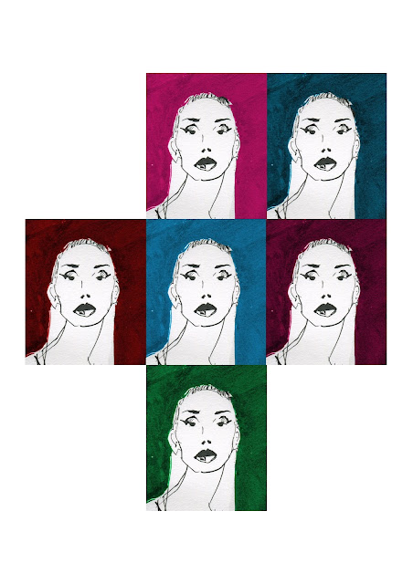
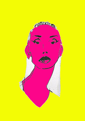
I already knew most of what was in the photoshop inductions but it was a good chance to try manipulate one of the ink drawings to see it in a different light using basic tools.

The original was like a cartoon so I thought exploring colour would bring the image a new tone.


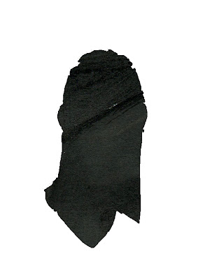
I like the multiples version as it shows how changing the background colour changes the mood of the image. A cropping of the head creates a bright profile shot and I liked the texture of the black background which I used to make a simple silhouette of the head.