
Monday, 17 December 2018
Tuesday, 13 November 2018
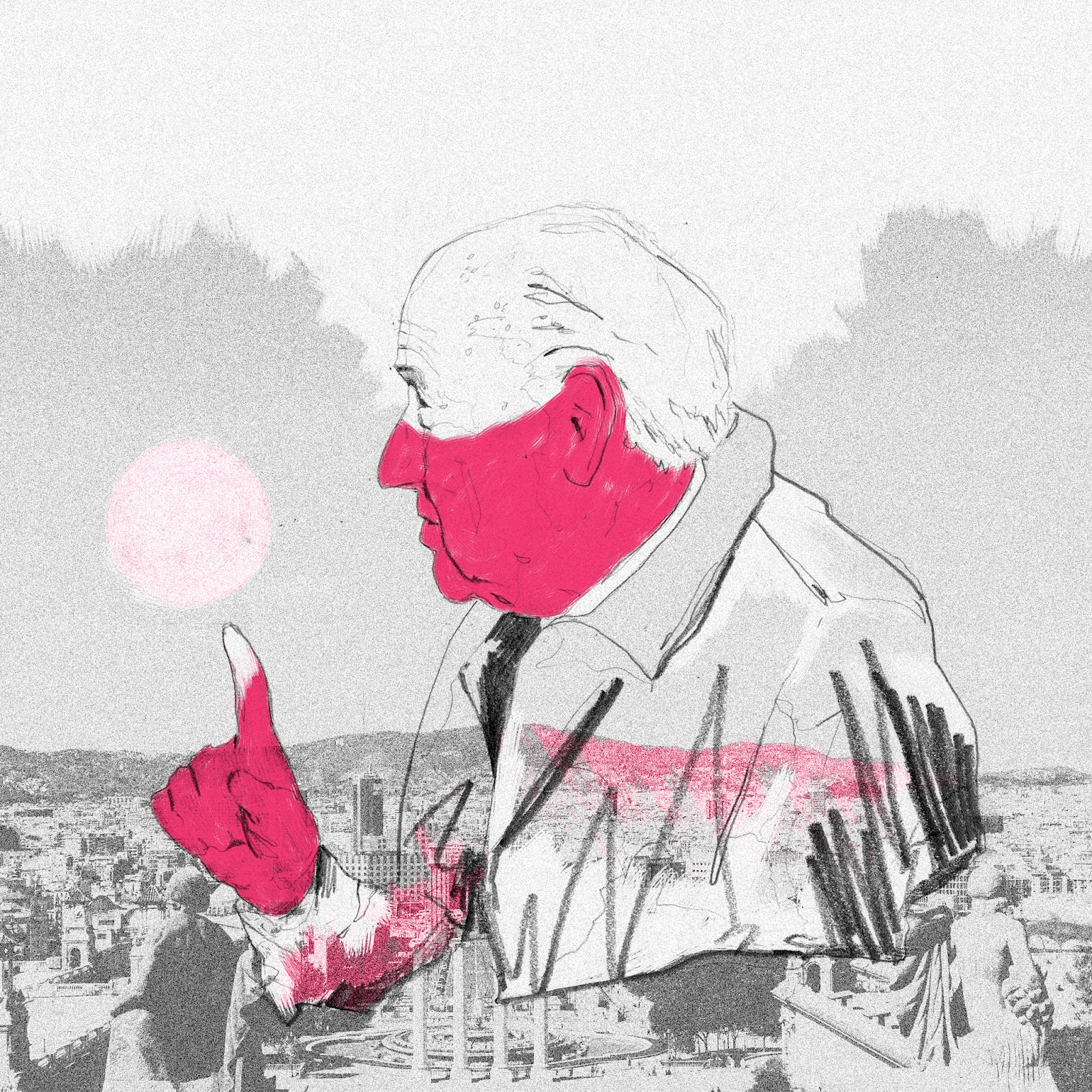
603 - Reflection 1
COP has taken up a lot of time so I've been making hand-drawn work with digital colour as I planned to in my proposal. The problem is they have all been one-off pieces with no particular purpose in trying to discover which area of the creative industry I might want to apply my practice to.
They're concept art if anything but for such a competitive part of the industry I think they are fairly mediocre. After a PP3 discussion with a peer I decided it's not an area of the industry I'm suited to, not yet anyway.
I'm rushing into drawings with no real industry focus or conceptual purpose and end up scanning rough drawings into photoshop and having to compensate with digital paints and brushes in order to bring the drawings to life rather than trusting in my drawings as the focal point of the work. It's important to establish a colour palette quickly so that I can save time when starting on something new. This also means my portfolio will start work visually as whole in terms of colour and tone. I need step back and invest more time and faith into my drawings so that I can spend much less time with digital colouring.
New focus for first semester
The new plan is to focus on the briefs suggested (Penguin & D&AD) and start making work tailored to selected areas of the industry such as book covers, editorial and informative illustration.
I will also be bolder with my drawings by using pen and ink with thicker lines rather than sketchy pencil drawings that lack punch. I need to use digital colour sparingly and be more subtle.
It seems obvious but it's easy to end up doing work you don't enjoy making and falling into the trap of making work you think will appeal to imaginary clients and employers. I want to really start making work I believe in that represents my interests and this should help me realise what area of industry I would suit in terms of aesthetic, tone and other important factors like how long it takes me to finish a piece of work I'm happy with.
Monday, 12 November 2018

Tuesday, 30 October 2018
603 - Statement of intent - Self Initiated
For this module I need to establish what areas of work my practice is best suited to. I also need to have a more cohesive portfolio. Experimenting is important but with each new piece of work I do at the minute I try a completely new way of working and I'd like to be more productive by using a successful piece of work and building on it.
I will take on the Penguin Student Design Awards - Owen Jones, Establishment book looks like it will suit my work best as I like the tone and subject matter.
D&AD adidas brief - this brief is open and interesting. Illustration for sport brands is something I'd love to work on. The brief is more for advertising and design but it will be fun and good practice for future briefs.
I want to strengthen my editorial work as a lot of editorial articles capture my interest as I'm easily distracted and I can create work quickly in response. I will select a few articles from editorials from editorials like New Scientist, The Guardian, New York Post, Vice etc and make responses.
Personal work
I think personal work is going to be very important for me. It's going to be vital in showing potential clients looking at my portfolio who I am as an illustrator and encourage like minded people to want to collaborate with me in the future. Making self initiated briefs with a focused discipline area such as editorial will help me realise what kind of work I want to make.
At the moment I'm trying to create work for various areas of the industry and spreading myself a bit thin so I want 603 to be at first an exploration of various briefs, as above, and begin to realise where I can thrive as creative practitioner.
I will continue to push my process forward using hand-drawn based work and digital colouring as I feel I am able to express my technical and informative skills as a practitioner best this way and this allows me to avoid relying on collage when I struggle to initially tackle a brief using hand-drawn methods. Hand-drawn only work will also make more visual sense cohesively for my portfolio.
Saturday, 27 October 2018
603 - 7 x 7
I had this piece along with another two as a series accepted for the Zero Zero Seven brief and featured on The City Talking site with a little bio about my work. It was nice getting a bit of coverage and recognition outside of the university bubble. They spelt my name wrong so I had them correct that. No point having publicity if they spell your name wrong!

Monday, 7 May 2018
Final outcomes
Final outcomes

I'm really pleased with these final pieces. This is the direction I've been wanting to be heading for a long time and feel I'm starting to create work I truly believe in. After spending hours messing around with digital painting I found a subtle way of maximising the use of a minimal amount of colour.
These were both resolved late in the module but I'm pleased I managed to produce something I can take into level 6 next year that excites me and makes me want to make lots more work in this natural style using my drawings. Using collage has given the drawings a boldness and strength they lacked on their own.

This one is fairly messy and unrefined because the methods were still fairly new to me but it was a significant breakthrough in using digital paint and collage in a looser and more expressive way.
Wednesday, 14 March 2018
Studio Brief 1: Live Brief
The chance to do a book cover for Stephen Hawking's A Brief History Of Time was a great opportunity.
My initial sketches and ideas lacked personality and were typical scientific illustrations seen in old text books and it was surprising how easy it is to fall into the trap of clichés and coming up with what you might think someone imagines a science based book would look like.

After a group crit and tutor lecturer advice, a more figurative image seemed to communicate better for the audience the brief wanted to appeal to. My first attempt was a good idea but wasn't executed well enough technically. The colours were too bland and the retro, screen print, 1960s feel I wanted wasn't relevant to the audience I needed to reach.

I used the brief to use Illustrator more and try create a figure using vectors based on my drawings. I was happy with the outcome but feel the focus was entirely on the figure without much thought given to the type and rest of the cover as a whole. It was striking yet perhaps too bare. Again I had technical problems with the file size and the whole process was time consuming.

I didn't want to restrict myself too much with digital drawing and use digital collage which was refreshing. It allowed for a more emotional and universal image that captures imagination about some of the profound subjects in the book without being too alienating to non science audiences.
I was inspired by the sci-fi film Interstella(2014) to start taking a serious interest in science and took inspiration from the use of corn fields seen in the film, people who are intrigued by the deeper philosophical meanings of astrology often have their interest sparked by film and popular culture.
This collage is by far the most successful in communicating a story and emotional response with the kind of audience Penguin wanted to capture. The design also fills the space well and the colours are warm and inviting in order to not put people off who may feel science is a cold and emotionless subject.
I've been trying to use drawing more this year and almost tried to forget about collage. Using collage again made me realise how much I love it and how I need to continue pushing collage just as much as the drawing. Collage allowed me to create a powerful composition that captures imagination, using the focal point couple to hint at a story. I'm also pleased with the small details that give added depth to the story such as the fragments breaking away from the couple which really works well in showing time as a physical form, visibly eroding the couple.
I didn't get to submit this design in time which is a shame but after the death of Hawking was announced I felt compelled to come back to the brief and make something worthy as a tribute to him and feel it was from the heart.

Friday, 2 February 2018
Goals for 504
Goals for 504
Better time keeping/management
503 seemed to be rushed towards the end and I want to manage my time better and have work ready for scheduled tutorials and group crits. I found with 503 I had done far less physical work for early group crits and therefore had no proper feedback.
Make more mistakes
Continuing to use varied methods and processes is still really important for 504. This is the time to use programs and techniques that I haven't fully explored even if it means finding out I don't want to use them ever again.
In summary my main goal is to be in a better place with my overall practice. I want to use this module as a way of experimenting more and being bolder in my work. I'm certain I haven't found a way of working that has fully clicked into place yet and want to exhaust other ways of working so I can at the very least know more about what I don't like and learn from any mistakes to take into next year with a confident idea of what kind of work it is I want to be making and what I'm making it for.
Wednesday, 17 January 2018
Summative Project Report
Overall I have enjoyed making work for the module. I feel my ability to produce professional level work is much more consistent. I've developed new methods of working by adapting to problems faced with each brief and feels like a definite progression in my all round craft which is really pleasing.
The Zine brief I reverted back to a collage making process which felt lazy and led to my decision to embrace drawing for the next brief and the determination to have faith in trusting myself to create good work based more on drawing than collage.
I was pleased with the final outcomes for Idea Pictures. I was able to create interesting outcomes with; layering and collaging the drawings. At this point of the module I was convinced this was the way I needed to work but although the editorials were aesthetically and conceptually successful I needed my work to have more power, variation and flexibility. It was nice recognition to have two of the editorials selected for the university NEST magazine.
Learning After Effects was a new skill gained and I intend to master it more as it makes sense to play around with the software and use the technicians' advice while at university. I've improved my knowledge of Illustrator too and it became a vital part of Printed Pictures, using Wacom tablets to trace my drawings.
For the early stages of the module I certainly felt a bit lost in having a quick and fluid way of approaching briefs but as it's progressed my process has become more streamlined and efficient because of the way I've brought all the hand drawn and digital tools together.
Whilst happy with the outcomes for the briefs I want to eradicate my tendency to be underproductive for the first half of each brief. I've confidence in my ability to produce a good final outcome but need to resolve ideas much quicker for a more professional approach.
I struggled keeping up with the work load and not spending enough time in the studio in the early stages of each brief I'm sure was the reason for this. I avoided some group crits and studio sessions as I felt I could get more work done at home but after spending more time in the studio environment for the last parts of the Printed Pictures and Moving Pictures briefs I now see how the studio can be a quiet place to work, focuses me and being around my peers stimulates a better work ethic. Experimenting in the print room is something I need to do more of as using printed textures is something I definitely want to become a feature of all future work.
I enjoy the image making process as a whole much more now I can see overall improvement in my standard of work. Last year I'd often feel relief at just managing to produce a final outcome and tended to enjoy the visual journal drawing process more as a sort of procrastination but now feel excited about the journey as a whole and enjoy the challenges more because of the new skills and techniques I've gained over this module. I hope to take this more complete approach into the new modules.
Tuesday, 16 January 2018


Monday, 15 January 2018
LAUIL503 - Moving Pictures - Reflective report
https://vimeo.com/251138684
I was concerned I'd not left much time to create an interesting sting but found the process surprisingly easy to manipulate and bring the illustrations to life.
The workshops were really valuable and playing with the basic tools was enough to create the story board I wanted.
I should have spent more time generating ideas in my visual journal after finishing the Printed Pictures but once I became comfortable with the tools I felt able to figure the final sequence out as I went along.
I was careful to have a loose storyboard idea in my head but still let the sound dictate the movement of the images.
There's such a thing as singing sand dunes and this eerie sound fit perfectly with the mood I wanted of experiencing something unnerving. The good depth of research meant I found a soundtrack that captured the feeling I wanted perfectly, being careful to only use free sound effects.
The feedback from peers and friends was very positive which was good to hear and it's ignited a serious interest in creating more animations. It's also exciting to see what is possible with just a very basic knowledge of After Effects - making the animations I researched look less intimidating.
Spending more time in the studio had a positive effect on my overall productivity. The studio environment was a nice change from my usual habit of doing the bulk of my work at home and because I needed to use the After Effects software at university it was another long term positive outcome of working on the brief - the general atmosphere was bright and professional giving me the confidence to come in to the studio more knowing I will be able to concentrate and have a solid environment I can come in to purely work in and treat my home as more of a place to relax.
After spending time playing with After Effects and seeing the outcome after just a few hours work I'm shifting my preference to a more digital process of working. I intend to research more simple but effective animations as it will be a useful skill to have, if only to animate my own illustrations as well as promoting my work in a more diverse way. Any illustrations I do from now on I will be conscious of how I can play with them and might move but will be conscious of applying the same principals I've learnt making images as it is a different craft all together.
Sunday, 14 January 2018
LAUIL503 - Printed Pictures - Reflective report
I'm happy with my final outcomes for the brief even if time management and organisation could have been better. I stuck to the initial proposal idea, developed it and realised the outcomes successfully without too much deviation from the core conceptual themes of hallucinations experienced by Oliver Sacks' patients.
The first few weeks had been unproductive. I focused heavily on creating drawings without enough thought about how to eventually combine them with print processes.
The drawings were linked to the themes and concepts but early combinations with print testing felt forced together with no subtlety.
The drawings were linked to the themes and concepts but early combinations with print testing felt forced together with no subtlety.
A few days in the print room speeded things up. It was a good experience using the print room properly and trying different colours. The mono print marks and patterns started to become the focal part of the images. However, it was still clashing with the drawings I'd done and around the Christmas crit period they looked clumsy and lacked a solid background base to hold it all together as a composition.
A useful experience has been the problems faced when scanning the prints for digital use. Bright and vivid printing inks felt appropriate to set the tone for an unsettling vision a patient might have but even high resolution scanning couldn't capture the fluorescent colours so I had to rethink my colours. Advice from my tutor and peers led to a more muted colour choice.
The most significant thing was tracing the pencil drawings in Illustrator which gave more refined clarity and allowed me to contain the printed textures.
Although peer crits were helpful for feedback it seemed right to change direction despite positive peer feedback on some of the early testing. The work was perhaps commercially friendly but I didn't like them aesthetically and felt it was important to go with my gut and continue pushing myself to create work I loved myself.
Despite spending a long time working with reds and yellows it wasn't working for the themes and moods I wanted to convey so even though a last minute decision to change to black and red it was right to do.
The skills and experiences learnt have been a step forward in terms of my practice developing. The new process of taming my loose, abstract drawing, using Adobe Illustrator is genuinley an exciting breakthrough for me and is a technique I want to expand and explore more in future projects. It meant I was able speed up my image making significantly and spend more time towards the end putting finishing touches to the textures and tones.
Subscribe to:
Comments (Atom)