Tuesday, 31 January 2017

OUIL404: Diorama

Diorama 

Once again I think it's all about making stuff and making mistakes. From the diorama I can take aspects that surprised me and like and also the things that don't work when analysing my practice as a whole. 


The experimentation is something I'm trying to bring together with my drawing.
What I need to do is be selective with which experiments/tests work together.
I'm still trying to cram everything I've been trying into one image, making the finished image confusing for the viewer. 
With the diorama I needed to simplify the cutouts and keep them separate from my more detailed pen strokes. That or just keep the cutout and drawn details consistent throughout the image. 
Things that worked
The brown paper added a nice texture and depth and worked well the piles of earth(without the pen drawn on top). Blocks of red used worked well to create a central line of sight from the figure at the bottom up to the trees at the top and I'm gradually thinking more and more about the effect shapes and lines have on the viewer. The diggers can be used as a frame to keep the viewer's gaze central. It's interesting to see how subtle changes in the arrangement can completely alter the line of sight. I'm realising how crucial composition is and that lines drawn on the page are needed to make you think about what or who is the main focus in the image. In the past I've always spend a long time moving things around on the page until the image works, all the time without having composition tools in mind before or after I'd finished the work. 
Considering what the arrangement will be before I even start drawing is tricky I find. But I suppose a drawing can be worked around and made to work or even be made more powerful with a few simple adjustments around the drawing to increase it's importance. 

OUIL406: Characters


It was interesting how the characters started to keep some features as they developed. One character had big teeth and that became it's main feature so I can see how certain characteristics can start to stick. Another owl type character I became quite attached to and that's also great how you start to anthropomorphise something on a piece of paper. This is a good thing if the character is to develop. The mind instinctively creates a persona for the owl and the restrictions also helped bring an edge to the character. Straight lines simplified the owl but somehow added character and attitude.


Saturday, 21 January 2017

OUIL405: Final Book

Final Book

I followed a narrative that I personally found interesting and also pushed myself to research material I would normally ignore as non scientific and I related to many of the principles of having a spiritual connection to nature.

Photoshop
I've learnt a few more things on photoshop and using it more instinctively now and becoming generally more skilled at it. I definitely need to learn more about Indesign and need to use Illustrator for drawing digitally as my manual drawn figures pixelated horribly in photoshop and look a bit tacky.
Happy with the final outcome?
I'm not blown away by the final outcome. I really enjoyed testing and drawing for ideas but the effort I put in that doesn't shine through although my concepts of celebration and people connecting with nature does come through. The colours I've used work for the peaceful, tranquil tone but overall it hasn't reached the level I thought it would have.

I wanted my drawings to be a dominant aspect of the book but trying to refine them, drawn from reference somehow takes energy from them. My sketchbooks did need to be refined but I need to find a successful way of making the move from sketches to final drawings whilst retaining the energy.

It's a neat representation of my untold story with some charm and it's not too ambiguous. I prefer naturally to have white backgrounds for my illustrations but for a book this doesn't work and it looks a little bare. Maybe in the future it's important to explore patterns especially for the cover.


Make more mistakes
It's not a totally bad thing to be unhappy with the book. Physically making the book was another skill learned and meeting a deadline, organising the time is really useful experience. I shouldn't be at a stage of being satisfied with my outcomes yet and being honestly critical is the only way to improve.

The main thing I've learnt from making the book is that sketching and testing lots is important but I need to find a refined and definitive direction for an outcome sooner in the next project. I spent too long in my sketchbooks and perhaps left the final two weeks with too much refining to do which meant the book didn't match my expectations.   

I'm being very positive and will learn from the mistakes I've made for this brief which will be really useful long term. I also have a bigger appreciation for Japanese art and researching Japanese illustrators in the library was fascinating. I'm in love with some new illustrators now which I can steal some ideas from.  


Wednesday, 11 January 2017

Final drawings

Final ideas development

I've found lots of reference photos of the Hanami festival to draw from. They're going to be helpful for drawing crowds and people in celebration.


Refining the drawings
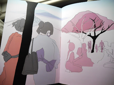
I've used the photos as reference to draw my characters but also made them controlled line drawings that I've tested with colour. Matt's idea of taking more time on the drawings and then manipulating digitally is what I'll do for all the pages. It'll let me try textures and colour arrangements without having to keep re-drawing everything if it goes wrong.   


I drew her from reference and printed of copies of the line drawing and this was great because I could try a few colour tests.


There is already a more delicate and finished quality with these which is encouraging for the tone of the book and I'm happy with the soft pink colour for the Cherry Blossom.
I will try some digital colouring which might give more control.

I've decided not to trace as I want the drawings to be refined but not copies of the reference photos.
It'll be interesting to see if I can mix them with collage, photography and maybe paper cut outs.


Book tutorial

The tutorial was critical but I'm only thinking positively about the criticism.
Although I've done plenty of testing and experimenting I now need to focus on refining my ideas.
I need to slow down my drawing and be refined and controlled in order to bring all my loose testing together.


The overall feedback was good but things I have missed are composition and communicating joy and celebration through people. I need to find references for crowds of people at festivals and people in more active poses to give the book some energy and charm.

Experimental for the sake of it
It's good to be experimental and take risks but I haven't taken a breath to stop and reflect on where all the tests are taking me. I've filled a book with drawings and found constantly messing around with lots of testing is a kind of creative procrastination that delays me from making decisions and developing the book.

Digital layering
I've layered some of the drawings with the tests with paint to get a rough idea.
I like the texture and busy noise of colour and shapes but it needs to be thought out more carefully and each layer needs to work with the other layers in mind rather than slapping them together and hoping for the best.


Digital

I really like the digital tests I did using filters and photos I had taken but they don't seem right for the themes of my book. The hand drawn pictures will get the themes of celebration across better then the digitals. Perhaps the digitals are too cold and clinical now the story of the book has changed. They would of been appropriate for my trees communicating idea but not the new direction.


Sunday, 8 January 2017

405 Visual Narratives Book

More testing

It was good to come in on Saturday for a couple of hours to get some painting done. The use of black with red in my sketchbook is striking but as my story has developed I needed to find a pale pink more suited to the Cherry Blossom tree which is central to the story.
Pink and black main colours for book
Pink needs to be close to Cherry Blossom petals
Cherry Blossom trees' bloom lasts barely a week and represents the fleeting, delicate nature of life so this needs to come through in the tone of the book.
Festival celebration
The Hanami festival is a time of celebration and joy so the pages of Hanami need to have more pink than black and maybe more focused on crowds of people who can communicate this well.


I feel like these painted text and textures could be used as back drops for some of the more detailed illustrations. I can layer in photoshop as I want use mixed media for the book.


I want to push my drawing more and make it more interesting. The figure drawings have so far been Frankenstein monsters and I like them because they are more unique to me and will reflect more personality. I feel I'm moving forwards drawing wise and allowing myself to be less worried about how 'nice' they look or what other people may judge them to be. I think improving technically at drawing doesn't mean how good you are at copying reality on to paper but it's about taking risks and trying new things.


Portrait

One problem is getting the right composition for portrait format. The trees and images that come to me are all landscape as that's the natural way to think of trees so it will take some thinking and arranging. Photoshop will let me move my trees and people around to make sense of it.
Maybe be a good idea is to draw the people/crowds and then the back drop separately?
All images should be done on the same paper to allow me to use multiply, opacity without too much difference in the paper colouring/levels.


Make mistakes and take risks
I'm not a confident painter and need to try using other media like paint to accompany my more controlled drawings. Combining paint with biro for example I really like because painting can achieve things drawing can't like the Cherry Blossom above, the paint is also softer and more suitable for the delicate petals.


OUIL404: Story board

Storyboard task

My film was Interstellar and the best way to plan the storyboard was to first write down the key events in the film and edit them down to the twelve most crucial moments that tell the rough outline of the story.
Don't worry about detail
Doing the storyboard did make me stop and think about the story of the film but I focused on the more memorable and dramatic moments that people would recognise easiest through a simple sketch.
Control & Communication - my line control became a bit erratic with the rough drawings and it's important I don't allow my rough sketches to become only recognisable to me, like my hand writing sometimes does.